Branding
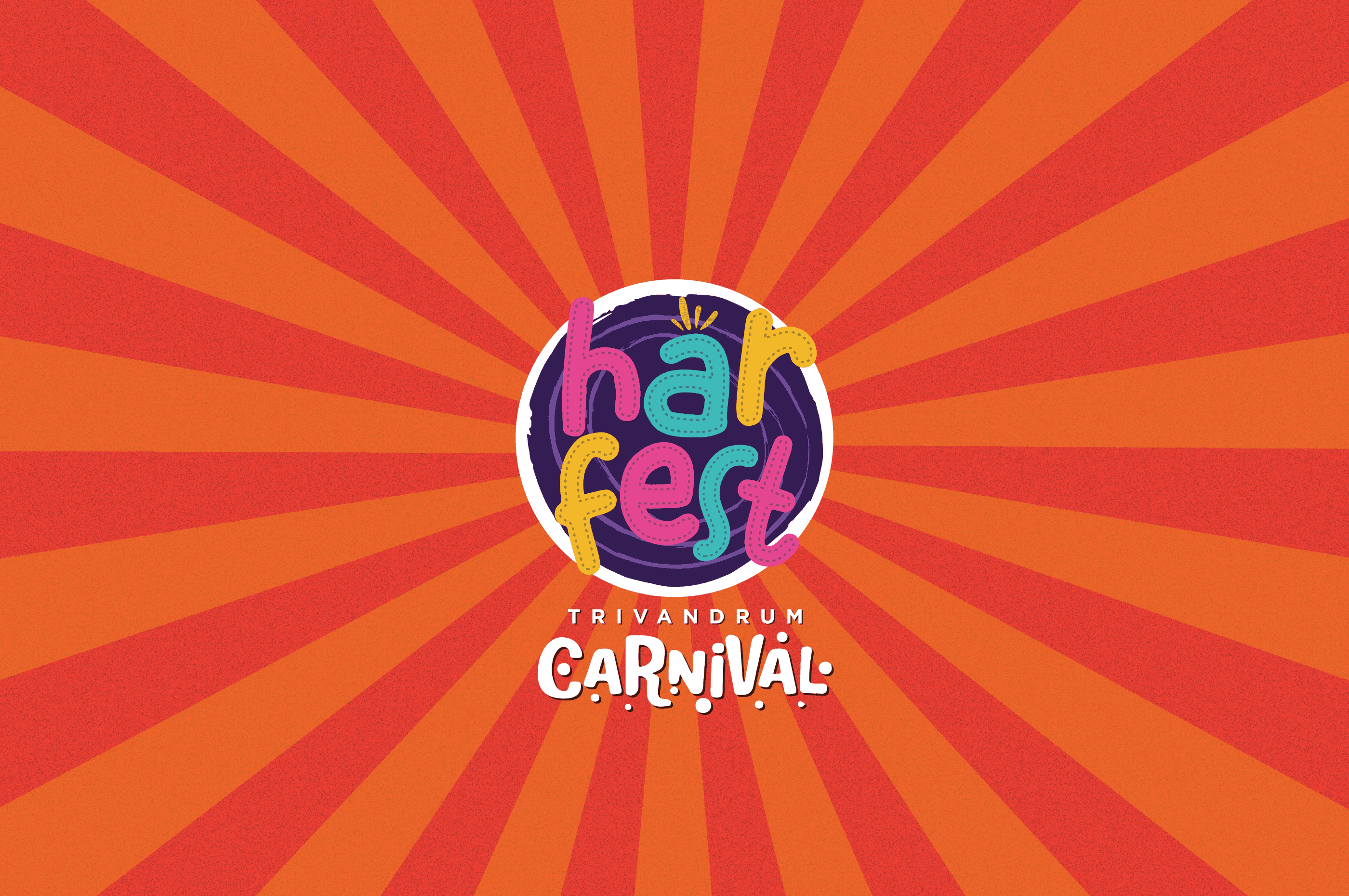
Harfest Branding
Harfest is Kerala’s Biggest Carnival designed with the idea of promoting livelihoods and fostering a sense of Community. You’ll find a host of activities in this week-long carnival. The First editions of Harfest happened in January 2024 at Mannuthy, Thrissur. The Second edition is happening in April 2024 at Kanakakkunnu, Thiruvananthapuram. The Third edition is planned in May 2024 at Kozhikode Beach and many more to follow.
Year :
2023
Industry :
Event / Festival
Client :
Festival Works
Project Duration :
8 weeks
The Challenge
Designing for Harfest meant creating an identity that could capture the energy of a large-scale, community-driven carnival while still feeling accessible and cohesive across multiple locations. The challenge was to balance vibrancy and playfulness with clarity ensuring the brand could scale across posters, social media, and on-ground applications without losing consistency or readability.

The Approach
The visual direction focused on building a lively and engaging identity system that reflects the spirit of celebration and community. Bright, high-contrast color palettes and radial backgrounds were used to evoke a sense of movement and excitement, drawing attention while maintaining a recognizable visual language across different touchpoints.
Typography and layout decisions were made to feel bold, playful, and approachable, aligning with the inclusive nature of the event. The system was designed to be flexible, allowing variations in color and composition while still feeling like part of the same brand.


Branding & Design System
The logo was designed using a playful, custom-styled type approach, emphasizing character and personality. Each letterform was crafted to feel dynamic yet balanced, creating a cohesive visual mark that stands out while remaining legible across sizes and formats.
A structured grid system was implemented to ensure consistency in alignment, spacing, and scalability. Clear spacing rules and logo usage guidelines help maintain visual clarity across applications, making the identity adaptable for both digital and print media.
Outcome
The final identity brings together energy, color, and structure resulting in a bold and memorable visual system for Harfest. The design translates seamlessly across posters, promotional materials, and digital platforms, helping establish a strong and recognizable presence for the carnival across different cities and editions.
More Projects


Branding
Harfest Branding
Harfest is Kerala’s Biggest Carnival designed with the idea of promoting livelihoods and fostering a sense of Community. You’ll find a host of activities in this week-long carnival. The First editions of Harfest happened in January 2024 at Mannuthy, Thrissur. The Second edition is happening in April 2024 at Kanakakkunnu, Thiruvananthapuram. The Third edition is planned in May 2024 at Kozhikode Beach and many more to follow.
Year :
2023
Industry :
Event / Festival
Client :
Festival Works
Project Duration :
8 weeks
The Challenge
Designing for Harfest meant creating an identity that could capture the energy of a large-scale, community-driven carnival while still feeling accessible and cohesive across multiple locations. The challenge was to balance vibrancy and playfulness with clarity ensuring the brand could scale across posters, social media, and on-ground applications without losing consistency or readability.
The Approach
The visual direction focused on building a lively and engaging identity system that reflects the spirit of celebration and community. Bright, high-contrast color palettes and radial backgrounds were used to evoke a sense of movement and excitement, drawing attention while maintaining a recognizable visual language across different touchpoints.
Typography and layout decisions were made to feel bold, playful, and approachable, aligning with the inclusive nature of the event. The system was designed to be flexible, allowing variations in color and composition while still feeling like part of the same brand.
Branding & Design System
The logo was designed using a playful, custom-styled type approach, emphasizing character and personality. Each letterform was crafted to feel dynamic yet balanced, creating a cohesive visual mark that stands out while remaining legible across sizes and formats.
A structured grid system was implemented to ensure consistency in alignment, spacing, and scalability. Clear spacing rules and logo usage guidelines help maintain visual clarity across applications, making the identity adaptable for both digital and print media.
Outcome
The final identity brings together energy, color, and structure resulting in a bold and memorable visual system for Harfest. The design translates seamlessly across posters, promotional materials, and digital platforms, helping establish a strong and recognizable presence for the carnival across different cities and editions.
More Projects
Branding
Harfest Branding
Harfest is Kerala’s Biggest Carnival designed with the idea of promoting livelihoods and fostering a sense of Community. You’ll find a host of activities in this week-long carnival. The First editions of Harfest happened in January 2024 at Mannuthy, Thrissur. The Second edition is happening in April 2024 at Kanakakkunnu, Thiruvananthapuram. The Third edition is planned in May 2024 at Kozhikode Beach and many more to follow.
Year :
2023
Industry :
Event / Festival
Client :
Festival Works
Project Duration :
8 weeks
The Challenge
Designing for Harfest meant creating an identity that could capture the energy of a large-scale, community-driven carnival while still feeling accessible and cohesive across multiple locations. The challenge was to balance vibrancy and playfulness with clarity ensuring the brand could scale across posters, social media, and on-ground applications without losing consistency or readability.
The Approach
The visual direction focused on building a lively and engaging identity system that reflects the spirit of celebration and community. Bright, high-contrast color palettes and radial backgrounds were used to evoke a sense of movement and excitement, drawing attention while maintaining a recognizable visual language across different touchpoints.
Typography and layout decisions were made to feel bold, playful, and approachable, aligning with the inclusive nature of the event. The system was designed to be flexible, allowing variations in color and composition while still feeling like part of the same brand.
Branding & Design System
The logo was designed using a playful, custom-styled type approach, emphasizing character and personality. Each letterform was crafted to feel dynamic yet balanced, creating a cohesive visual mark that stands out while remaining legible across sizes and formats.
A structured grid system was implemented to ensure consistency in alignment, spacing, and scalability. Clear spacing rules and logo usage guidelines help maintain visual clarity across applications, making the identity adaptable for both digital and print media.
Outcome
The final identity brings together energy, color, and structure resulting in a bold and memorable visual system for Harfest. The design translates seamlessly across posters, promotional materials, and digital platforms, helping establish a strong and recognizable presence for the carnival across different cities and editions.