UI / UX Design
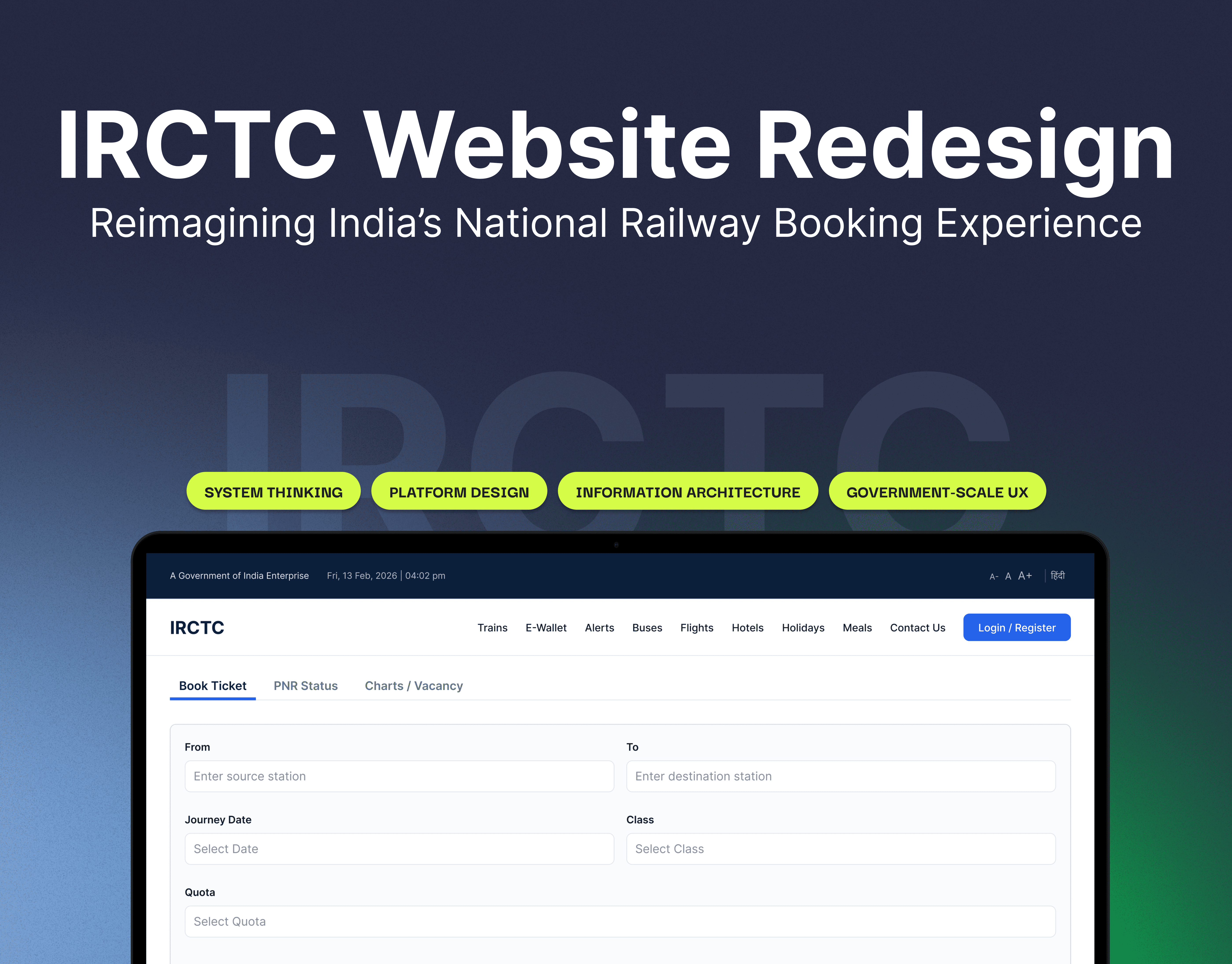
IRCTC App Rdesign
A UX-led redesign of the IRCTC mobile app focused on simplifying the ticket booking experience. By identifying recurring user pain points—such as cluttered interfaces, confusing flows, and high booking anxiety—the project reimagines key screens to improve clarity, reduce friction, and create a more intuitive and reliable journey.
Year :
2025
Industry :
Tech
Client :
My Captain Portfolio Project
Project Duration :
1 week

Understanding User Pain Points
The redesign began with analyzing real user feedback across platforms, revealing consistent issues in the booking experience. Users struggled with app crashes, excessive steps, unclear train availability, and poor error handling. These issues not only slowed down the process but also increased anxiety during time-sensitive bookings.

Identifying Gaps Through Competitive Analysis
A comparison with platforms like Ixigo and ConfirmTkt highlighted the importance of simplicity and guidance in booking flows. Competitors used clearer layouts, progress indicators, and better feedback systems, making the experience feel more predictable and less stressful. This helped define benchmarks for improving usability.


Simplifying the Booking Experience
The core focus was reducing friction across key touchpoints. The home screen was decluttered to highlight primary actions, search results were structured for quick comparison, and forms were redesigned with better grouping and clarity. Each decision aimed to reduce cognitive load and help users move faster with confidence.
Designing for Clarity & Trust
Beyond usability, the redesign focused on building trust during critical moments like payment and confirmation. Clear status indicators, highlighted PNR details, and improved visual hierarchy ensure users always understand what’s happening. The result is a smoother, more transparent experience that reduces uncertainty.


More Projects


UI / UX Design
IRCTC App Rdesign
A UX-led redesign of the IRCTC mobile app focused on simplifying the ticket booking experience. By identifying recurring user pain points—such as cluttered interfaces, confusing flows, and high booking anxiety—the project reimagines key screens to improve clarity, reduce friction, and create a more intuitive and reliable journey.
Year :
2025
Industry :
Tech
Client :
My Captain Portfolio Project
Project Duration :
1 week
Understanding User Pain Points
The redesign began with analyzing real user feedback across platforms, revealing consistent issues in the booking experience. Users struggled with app crashes, excessive steps, unclear train availability, and poor error handling. These issues not only slowed down the process but also increased anxiety during time-sensitive bookings.
Identifying Gaps Through Competitive Analysis
A comparison with platforms like Ixigo and ConfirmTkt highlighted the importance of simplicity and guidance in booking flows. Competitors used clearer layouts, progress indicators, and better feedback systems, making the experience feel more predictable and less stressful. This helped define benchmarks for improving usability.
Simplifying the Booking Experience
The core focus was reducing friction across key touchpoints. The home screen was decluttered to highlight primary actions, search results were structured for quick comparison, and forms were redesigned with better grouping and clarity. Each decision aimed to reduce cognitive load and help users move faster with confidence.
Designing for Clarity & Trust
Beyond usability, the redesign focused on building trust during critical moments like payment and confirmation. Clear status indicators, highlighted PNR details, and improved visual hierarchy ensure users always understand what’s happening. The result is a smoother, more transparent experience that reduces uncertainty.
More Projects
UI / UX Design
IRCTC App Rdesign
A UX-led redesign of the IRCTC mobile app focused on simplifying the ticket booking experience. By identifying recurring user pain points—such as cluttered interfaces, confusing flows, and high booking anxiety—the project reimagines key screens to improve clarity, reduce friction, and create a more intuitive and reliable journey.
Year :
2025
Industry :
Tech
Client :
My Captain Portfolio Project
Project Duration :
1 week
Understanding User Pain Points
The redesign began with analyzing real user feedback across platforms, revealing consistent issues in the booking experience. Users struggled with app crashes, excessive steps, unclear train availability, and poor error handling. These issues not only slowed down the process but also increased anxiety during time-sensitive bookings.
Identifying Gaps Through Competitive Analysis
A comparison with platforms like Ixigo and ConfirmTkt highlighted the importance of simplicity and guidance in booking flows. Competitors used clearer layouts, progress indicators, and better feedback systems, making the experience feel more predictable and less stressful. This helped define benchmarks for improving usability.
Simplifying the Booking Experience
The core focus was reducing friction across key touchpoints. The home screen was decluttered to highlight primary actions, search results were structured for quick comparison, and forms were redesigned with better grouping and clarity. Each decision aimed to reduce cognitive load and help users move faster with confidence.
Designing for Clarity & Trust
Beyond usability, the redesign focused on building trust during critical moments like payment and confirmation. Clear status indicators, highlighted PNR details, and improved visual hierarchy ensure users always understand what’s happening. The result is a smoother, more transparent experience that reduces uncertainty.