UI / UX Design
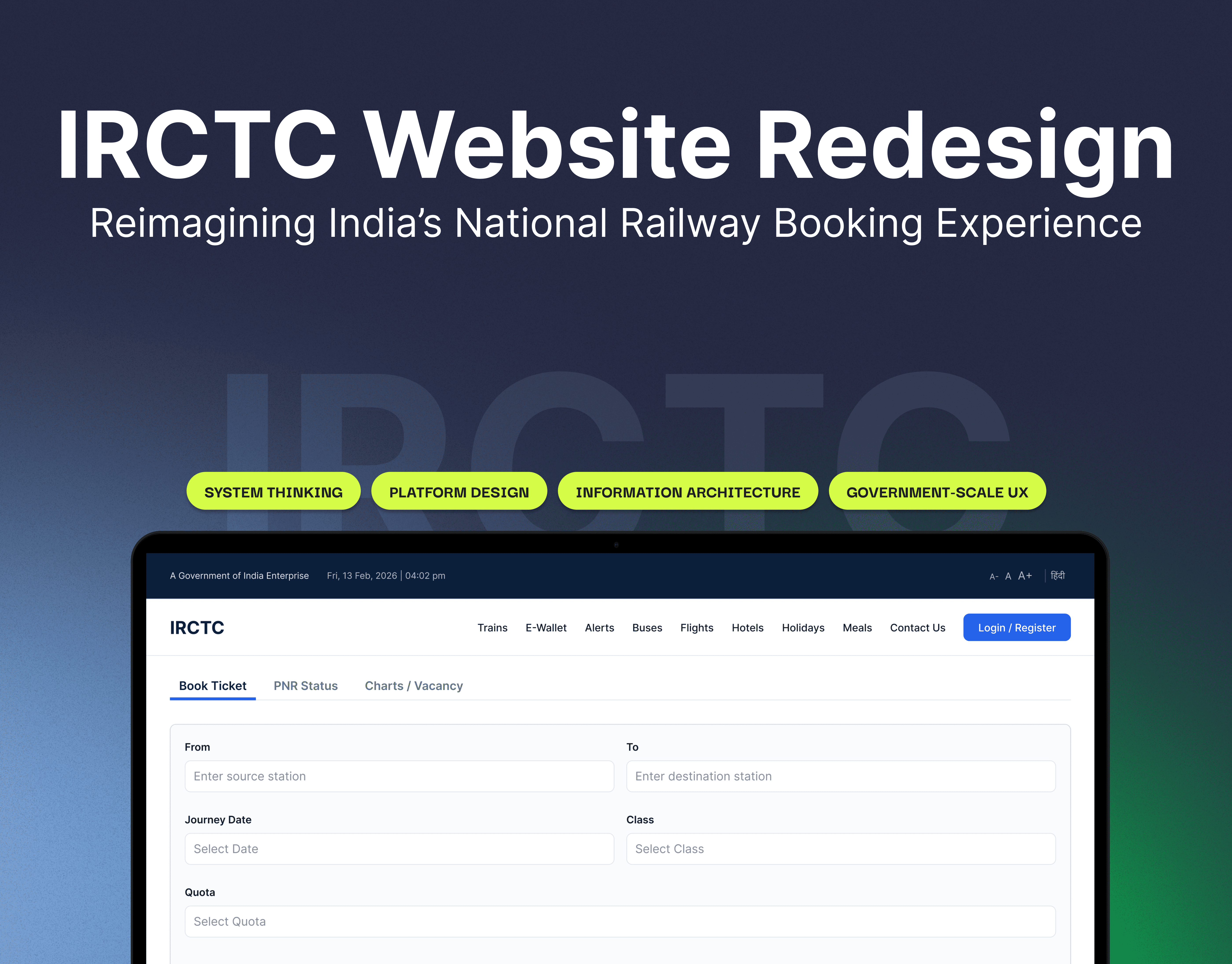
IRCTC Website Redesign
A system-first redesign of the IRCTC website focused on improving clarity, reducing cognitive overload, and structuring a high-density, government-scale platform. The project reimagines the booking experience by refining hierarchy, organizing complex information, and creating a more intuitive, trust-driven user journey without oversimplifying the system.
Year :
2025
Industry :
Tech
Client :
My Captain Portfolio Project
Project Duration :
2 weeks
Understanding the Problem Space
The existing IRCTC platform serves millions daily but struggles with visual density and inconsistent hierarchy. Critical booking actions compete with secondary services, making the experience overwhelming—especially in time-sensitive scenarios like Tatkal booking. The challenge was not a lack of functionality, but a lack of structured clarity.

Designing for Complexity, Not Removing It
Instead of simplifying the platform by removing information, the focus was on reorganizing complexity. This meant introducing clear visual hierarchy, better grouping of related content, and structured layouts that allow users to scan and act quickly—while still retaining the depth expected from a national-scale system.


Refining the Booking Journey
The booking flow was redesigned end-to-end to reduce friction across high-data screens. From search results to class selection, passenger details, and payment, each step was restructured to guide users with clarity. The goal was to make decision-making faster, especially in high-pressure scenarios where time and availability are critical.
Designing for Trust and Institutional Tone
Unlike typical consumer products, IRCTC requires a sense of reliability and authority. The redesign maintains an institutional tone while modernizing the interface—balancing usability with trust. Visual decisions were intentionally restrained to avoid over-stylization, ensuring the platform feels dependable and familiar.

More Projects


UI / UX Design
IRCTC Website Redesign
A system-first redesign of the IRCTC website focused on improving clarity, reducing cognitive overload, and structuring a high-density, government-scale platform. The project reimagines the booking experience by refining hierarchy, organizing complex information, and creating a more intuitive, trust-driven user journey without oversimplifying the system.
Year :
2025
Industry :
Tech
Client :
My Captain Portfolio Project
Project Duration :
2 weeks
Understanding the Problem Space
The existing IRCTC platform serves millions daily but struggles with visual density and inconsistent hierarchy. Critical booking actions compete with secondary services, making the experience overwhelming—especially in time-sensitive scenarios like Tatkal booking. The challenge was not a lack of functionality, but a lack of structured clarity.
Designing for Complexity, Not Removing It
Instead of simplifying the platform by removing information, the focus was on reorganizing complexity. This meant introducing clear visual hierarchy, better grouping of related content, and structured layouts that allow users to scan and act quickly—while still retaining the depth expected from a national-scale system.
Refining the Booking Journey
The booking flow was redesigned end-to-end to reduce friction across high-data screens. From search results to class selection, passenger details, and payment, each step was restructured to guide users with clarity. The goal was to make decision-making faster, especially in high-pressure scenarios where time and availability are critical.
Designing for Trust and Institutional Tone
Unlike typical consumer products, IRCTC requires a sense of reliability and authority. The redesign maintains an institutional tone while modernizing the interface—balancing usability with trust. Visual decisions were intentionally restrained to avoid over-stylization, ensuring the platform feels dependable and familiar.
More Projects
UI / UX Design
IRCTC Website Redesign
A system-first redesign of the IRCTC website focused on improving clarity, reducing cognitive overload, and structuring a high-density, government-scale platform. The project reimagines the booking experience by refining hierarchy, organizing complex information, and creating a more intuitive, trust-driven user journey without oversimplifying the system.
Year :
2025
Industry :
Tech
Client :
My Captain Portfolio Project
Project Duration :
2 weeks
Understanding the Problem Space
The existing IRCTC platform serves millions daily but struggles with visual density and inconsistent hierarchy. Critical booking actions compete with secondary services, making the experience overwhelming—especially in time-sensitive scenarios like Tatkal booking. The challenge was not a lack of functionality, but a lack of structured clarity.
Designing for Complexity, Not Removing It
Instead of simplifying the platform by removing information, the focus was on reorganizing complexity. This meant introducing clear visual hierarchy, better grouping of related content, and structured layouts that allow users to scan and act quickly—while still retaining the depth expected from a national-scale system.
Refining the Booking Journey
The booking flow was redesigned end-to-end to reduce friction across high-data screens. From search results to class selection, passenger details, and payment, each step was restructured to guide users with clarity. The goal was to make decision-making faster, especially in high-pressure scenarios where time and availability are critical.
Designing for Trust and Institutional Tone
Unlike typical consumer products, IRCTC requires a sense of reliability and authority. The redesign maintains an institutional tone while modernizing the interface—balancing usability with trust. Visual decisions were intentionally restrained to avoid over-stylization, ensuring the platform feels dependable and familiar.